Hello! Welcome to the Spellbinders Jane Davenport Blog Hop!
You came here from: Virginia Lu (full list is down below!)
I had so much fun playing with some Inkredible inks for this fabulous hop. It was my first time and I absolutely love how vibrant these can be or muted depending on how to play with them. Be sure to scroll all the way through for the GIVEAWAY details below!
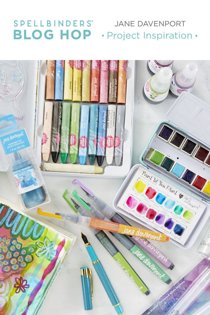
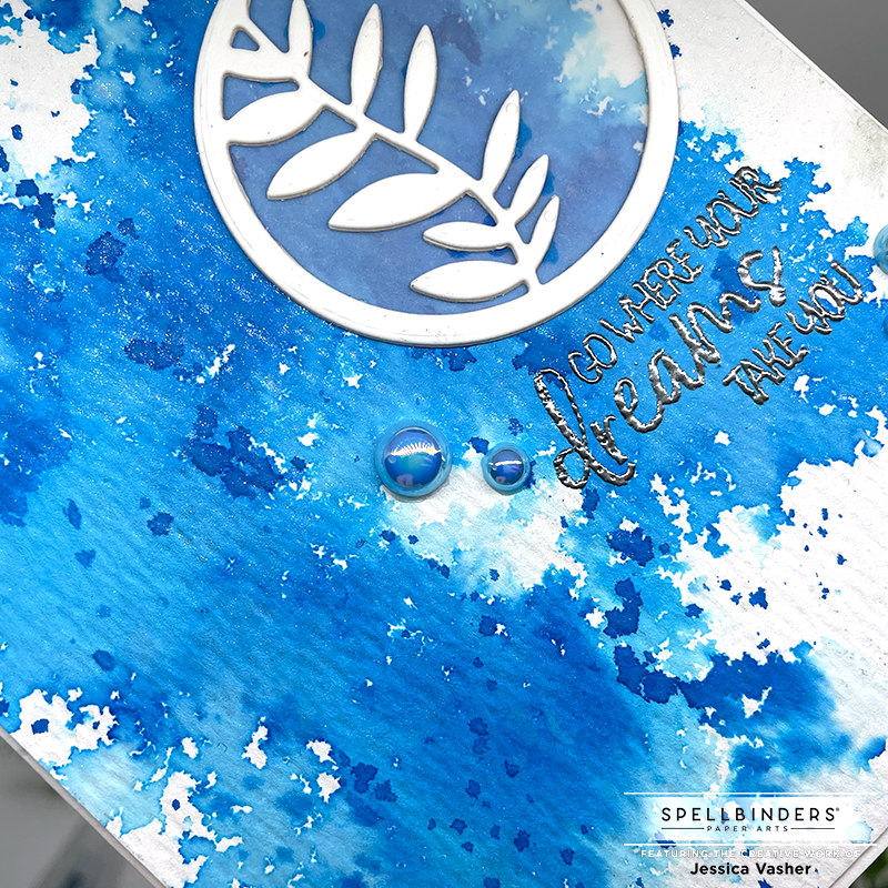
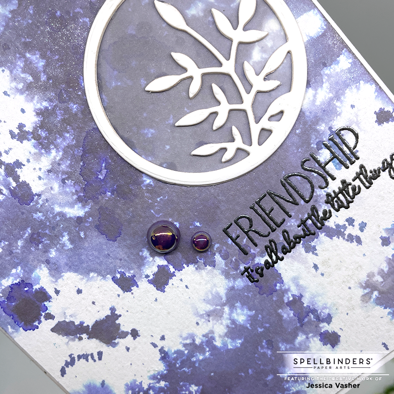
I started off with a sheet of watercolor card stock cut down to 4.25 x 5.5 and I used the textured side. For the first card, I used the color Inkredible Ink Hydrangea, which is this bright beautiful blue color. I misted the cardstock with clean water, making sure to leave some areas that were dry. I then tapped the ink into the watered areas, straight out of the bottle. Once I achieved the amount I wanted, I let the background air dry (which is hard to do when you are limited on craft time!). I decided to jump right into using the other color Inkredible Ink Blueberry, but something I did by accident (but is my usual MO) is I flipped the water color cardstock over and used the smoothed side. I didn’t realize it until I was done with the card. However, I proceeded with the same technique, mist with water and then tapped the color onto it. But something I was mystified by was that the color was much brighter a first, but then faded to a muted purple. Well, it was because of how I had the cardstock turned!
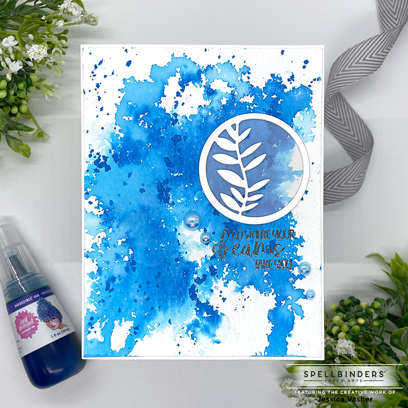
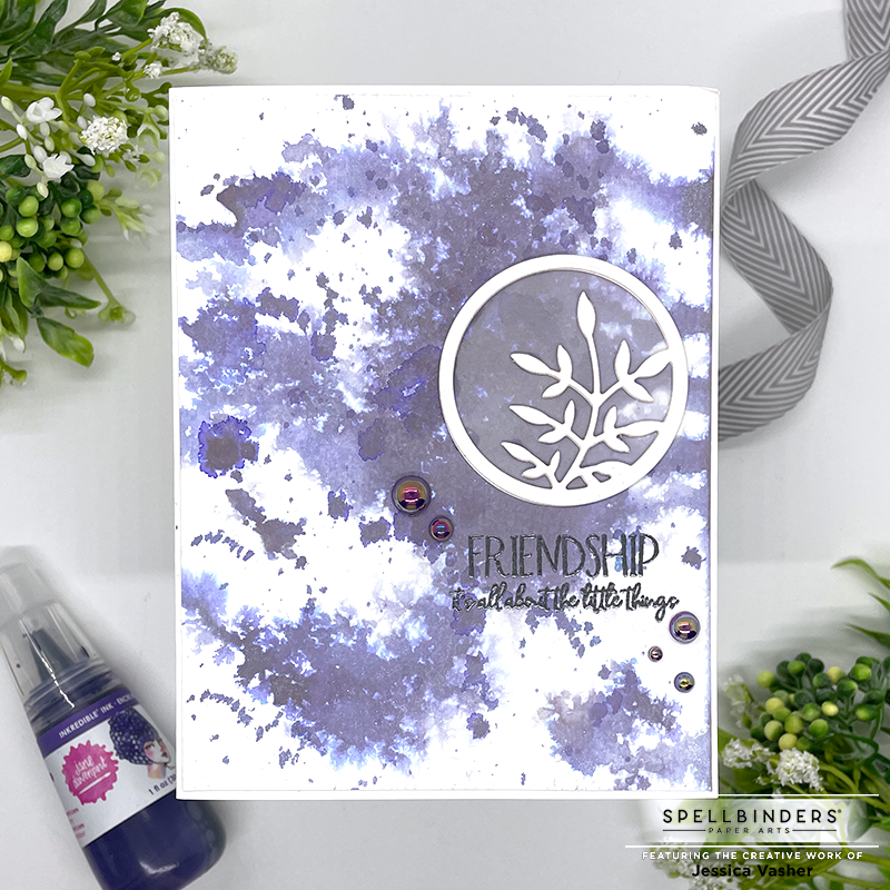
Once the panels dried, I then added some color to my glass media mat and grabbed a smaller fluffy brush and proceeded to splatter ink right on. I loved how the concentrated color was darker and showed up so, like I had used a different product.

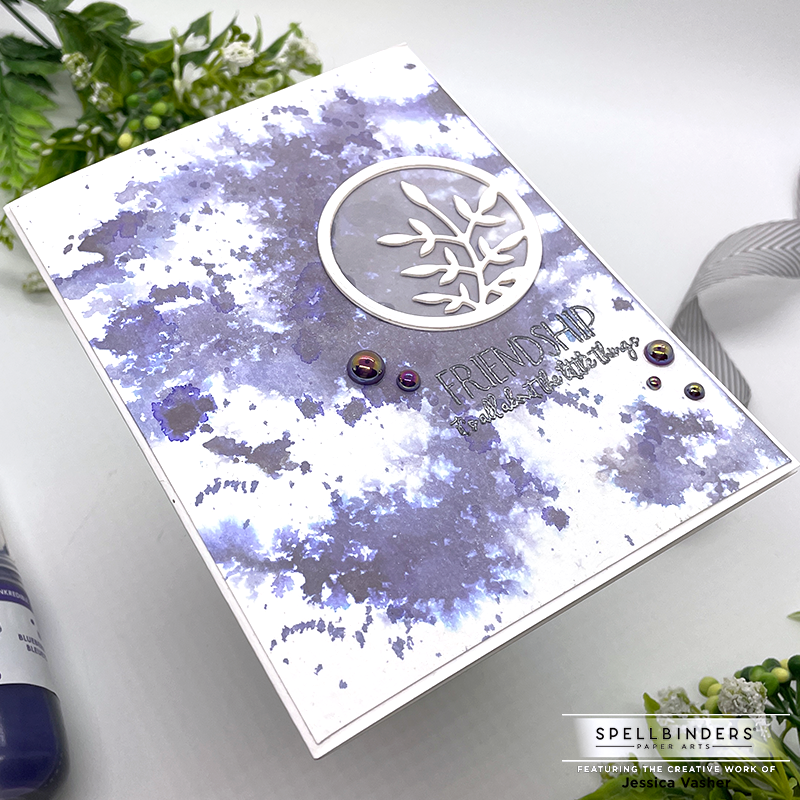
I then pulled out a stamp set from a previous Card of the Month club for the sentiment, and a previous Small die of the month for the leafy medallion. I added vellum to the medallion to help it pop against the splatter backgrounds. I then trimmed the panels down .25 inch and added them all together! I finished them off with some Shimmer Mist and some baubles.
Giveaway:
To celebrate this event, we are giving away a $50 gift certificate to 3 lucky blog readers – selected from the comments on our blog. Giveaway closes on Sunday, July 4th 11:59 pm EDT. The winners will be announced in the blog hop post the following Wednesday. Winner is responsible for shipping cost, duties and taxes.
Up Next is: Rosemary Dennis
- Spellbinders Blog
- Annie Williams
- Marie Heiderscheit
- Ilina Crouse
- Jennifer Snyder
- Linh Van
- Deborah Jenkins
- Virginia Lu
- Jessica Vasher <—- You are here!
- Rosemary Dennis <——-UP NEXT!
- Heather Hoffman
- Jennifer Kotas
- Natasha Vacca
- Norine Borys

[…] Marie Heiderscheit Ilina Crouse Jennifer Snyder Linh Van Deborah Jenkins Bibi Cameron Virginia Lu Jessica Vasher Rosemary Dennis Heather Hoffman Jennifer Kotas Natasha Vacca Norine […]
[…] Jessica Vasher […]
This is an adorable card!
Many thanks for commenting!
Love these watercolor cards
I am so glad you like them!
I love the watercolor splatter.
Splattering is one of my favorite techniques. Hides mistakes in a pinch!
That blue is gorgeous! I have to have it!!!! Thanks for sharing.
Its soooooo vibrant!
Love your work!
Thank you so much for commenting! It means a lot to me.
Love the watercolor technique!!
Thank you!
Your work is very beautiful
I was very happy to see you use these inks. I would like to know more ways to use them. Love the intense colors.
I am going to have to pick up a few more! Loved the intensity!
I love the idea of coloring the wet watercolor paper with the ink. I have to try this one.
I love the way it spreads when you wet the paper first!
I love your cards! I love the way the paint splashes across the front ofthe card.
Pretty!
Stunning colors and backgrounds!
Your cards are very, very cool!
Great cards! The products look amazing!
What a nice technique. I LOVE the colors
Great backgrounds! The colors in these new products are amazing.
Maybe I could do this mixed media look! Doesn’t seem too messy for this control freak! Great cards.
Lovely, abstract, loose watercolor cards
Splendid colors, backgrounds, and cards!
Such pretty cards!
You used my two most favorite colors. I’ll Have to try your technique as I haven’t done it before. Thank you for the inspiration.
Interesting way to use the inks and also other products.
Such beautiful cards! I love how the purple-y dispersed on the smooth side of your paper.
I absolutely think both of your cards are Wonderful! Love, love those blues. Oh my! You can certainly see the difference in the depth of colour just by having done one of the smooth side & the other on the textured side. Thanks!
Love your cards, especially the backgrounds you created.
I love the wonderful colour in these ink splattered backgrounds! They really do stand out!!Thanks so much for the great inspiration! Stay safe! 🙂
Beautiful watercolored cards !!
I love these backgrounds! Very pretty!
I love your cards, and I am really like the way you used the inks!
Looks like these inks would be so fun to “play” with. Making these backgrounds would be a great project with a few crafty friends.
Pretty cards! I love the way the backgrounds turned out!
I love the artsy backgrounds on your cards. Just beautiful. Thanks so much for sharing!
Love these cards and the embossing WOW!
Nice showing of the color. I like the added small circle. Great finish.
Gorgeous backgrounds on these sweet CAS designs.
I appreciate the blue one most because of the intensity of the color. Thanks for sharing!
Lovin’ the look of your tapped and splattered inks…fabulously random splotches!